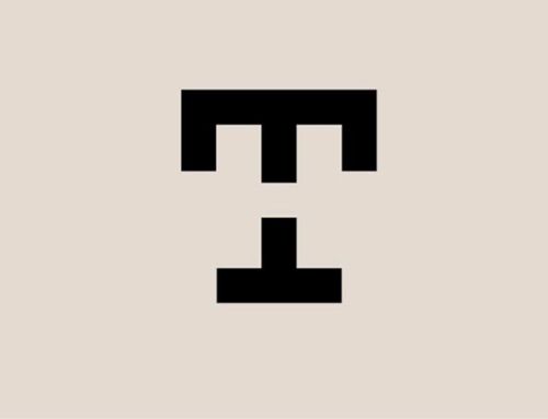
I've been working more on my dad's logo and have come to a more final version! Exciting stuff.
  |  |
|
I've been working more on my dad's logo and have come to a more final version! Exciting stuff.
0 Comments
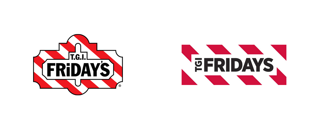 Good job, Fridays! Much needed improvement. After seeing the new logo, I went to see if they had done any other rebranding. When I went to their website I was very impressed! Fridays is really stepping up their game. Love this new web design: 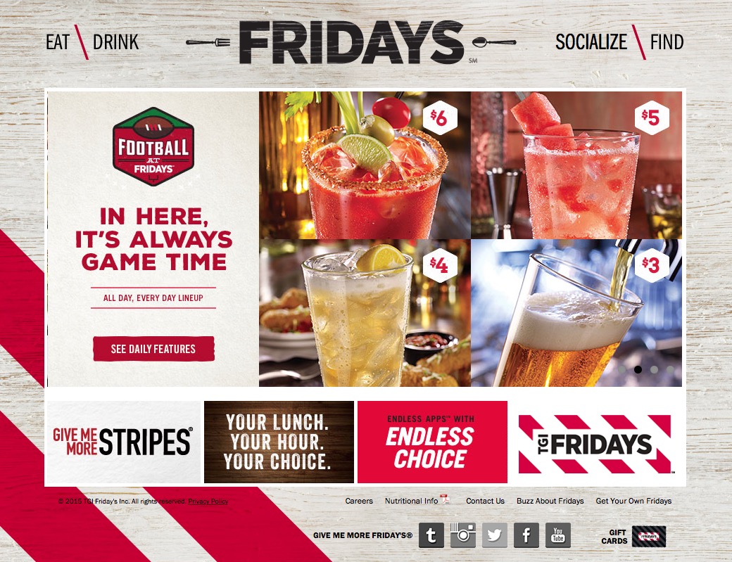 Yummy!
With Extra Gum's ad right now! Watch the full ad below: What a sweet story! Albeit, it is a little cheesy for gum, but it definitely makes you think about how long you've been chewing and sharing gum and highlights how long Extra has been around.
I also think this is a great example of how terrible copy can ruin a beautifully art directed ad... Give Extra, Get Extra? I hate how cheap the tagline is as an ending for such a long, emotional story!
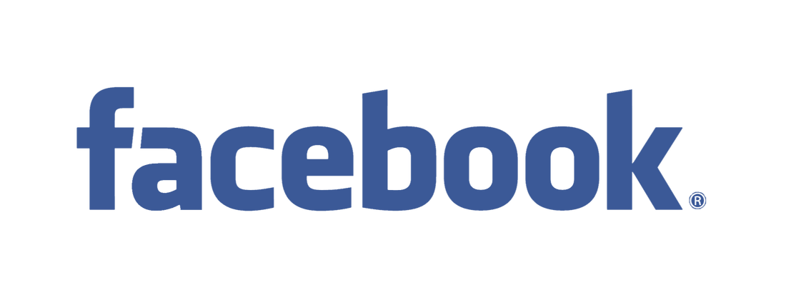
Did anyone else notice that Facebook changed their logo?
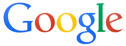
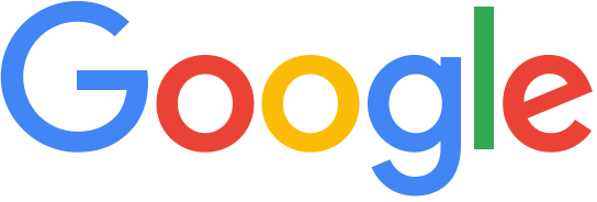
I will say, I think it was smart for them to launch this logo in the midst of the Google logo launch!
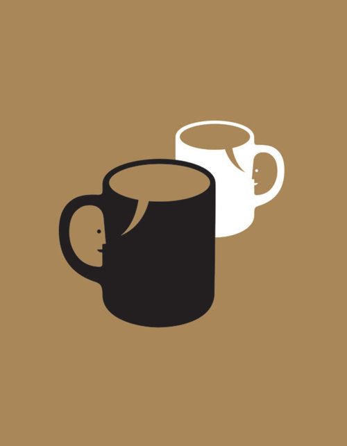
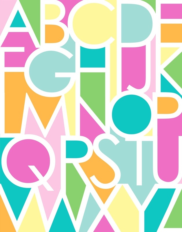
It looks like Facebook did a similar change to their logo, making it more rounded, playful and modern. I really like the new logo! What do you think? I've been trying to conceptualize a logo for my personal brand. I'd really like to use negative space in my design, so here are a few fun examples that inspired me!
Google's new logo has received quite a bit of criticism. Compare the old vs. new below....
Personally, I like the new logo! Google's logo has always been a serif font, so it's refreshing to see something different. Both logos are great (obviously, it's Google) but I love how the logo is playful and inviting. I think it reflects Google's ever-changing brand personality better than the strict, intelligent serif logo. A lot of the criticism for the new logo has been based on the idea that, "The new logo looks childish and unintelligent." While I agree that the new logo is definitely less academic looking than previous versions, I think it reflects the recent updates and changes Google has made to their overall brand. For example, this logo will make a lot more sense when paired with Google Hangouts. Yes, Google used to be a more "academic" brand, but they have changed a lot since they first started as a search engine. Check out the video below to see their evolution: Criticism is bound to come with any change, and I'm sure Google dealt with similar critics with past logo changes. Regardless, it's obvious (to me, at least) that a lot of time and effort went into developing the new logo. In my opinion, it matches Google's brand personality and is a more accurate reflection of what Google is capable of. 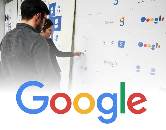 And just saying, I am REALLY glad they didn't go with the logo on the top right of the photo above!
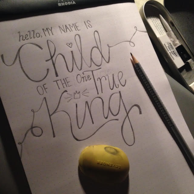
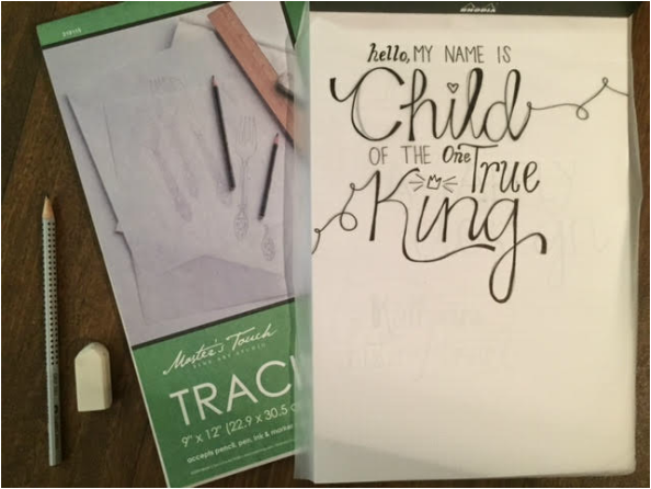
Hand Lettering"You have good handwriting" is one of those compliments I am used to receiving. I like addressing the envelope more than picking out the card inside. My to-do lists are categorized by different handwritten fonts. So naturally, I've decided to really hone in on hand lettering as a personal creative skill. 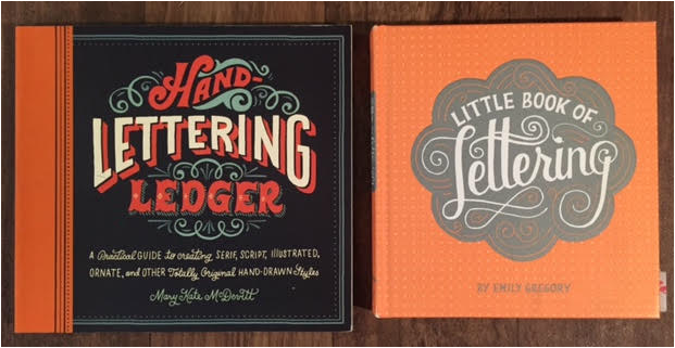 So far, I've acquired all of the necessary tools (and then some.) This includes tracing paper, pencils, erasers (lots of them), graphite pencils, rulers, a fine point pen, dot grid paper, and the list goes on. I also found two books (see photo above) that really help me gather ideas and inspiration, as well as practice on their ledgers. If you're interested in hand lettering, I suggest you get these materials as well! Another thing that has really helped me is finding inspiration on Pinterest. Pinterest has everything from fonts and font pairing ideas to other examples of hand lettering. Sometimes I will just pin a certain quote and use it for a hand lettering project!
This is one of my favorite projects I have done so far. It ended up being the first part to a series of canvases that I gave to my fiancé's family for Christmas. This shows the process of hand lettering from start to finish. 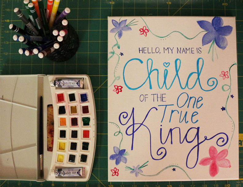 Hand lettering is a time-consuming, detail oriented hobby that takes lots and lots of practice, but it is a perfect creative outlet for me. It really helps me take my mind off of everything else and simply focus on the shapes and curves of the letters. I love fonts and typography, so I don't mind letting it consume my mind!
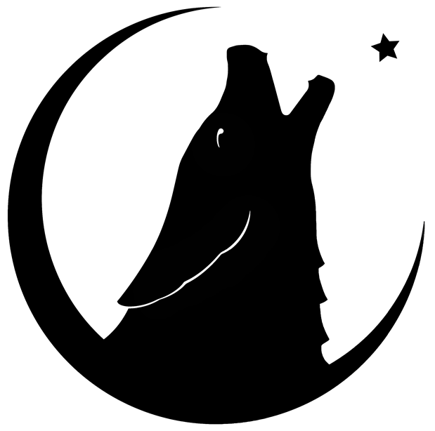
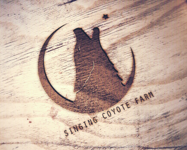
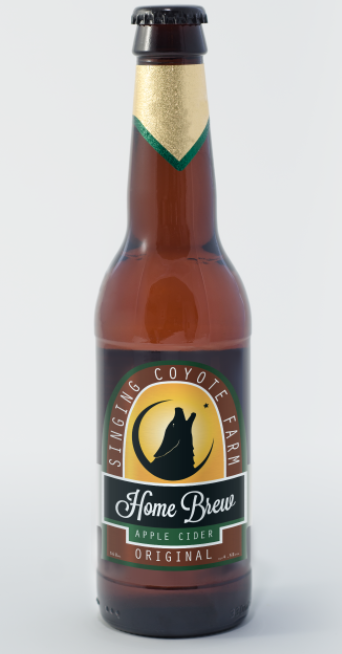
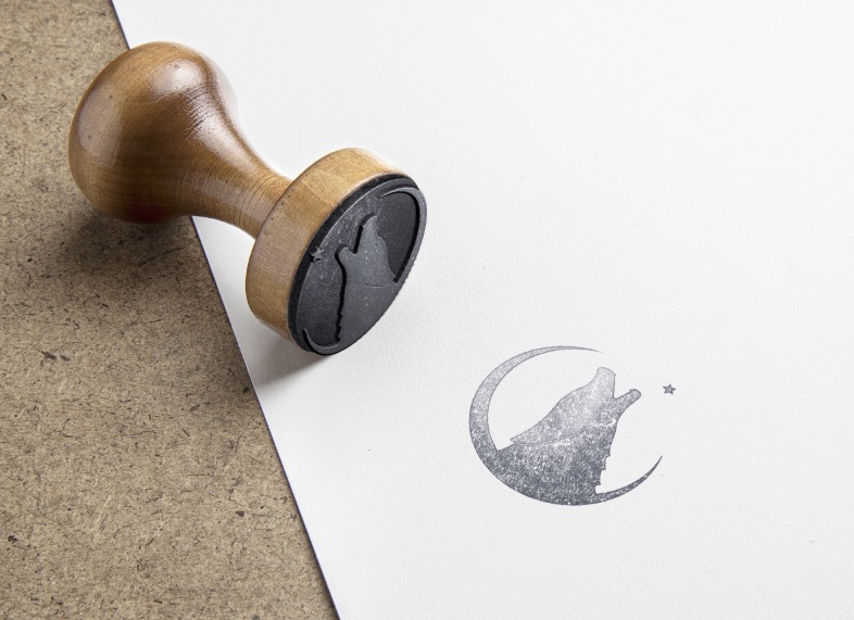
My next endeavor will be to turn my hand lettering into digital formats- I am hoping to master this skill in time to include it in some of my campaigns for Portfolio 1 and also to use in the collateral for my and Derek's wedding. If you have any tips on digitalizing your own fonts, leave them in the comments below! I'd love some free advice. Custom logo for my family's farm.My family lives on a small "farm" (the only farm animal we have is chickens.) But those chickens produce a ton of eggs and my dad has considered selling them at the local farmer's market, along with fresh tomatoes, peppers, corn, etc. from his garden. While we've tossed the idea around, we never made any real steps towards branding and selling the farm products until recently, (within the last six months), when my dad started homebrewing. As soon as the homebrews started getting bottled and the idea of custom caps and labels came about, the drafts for a logo started. Below is the latest draft... 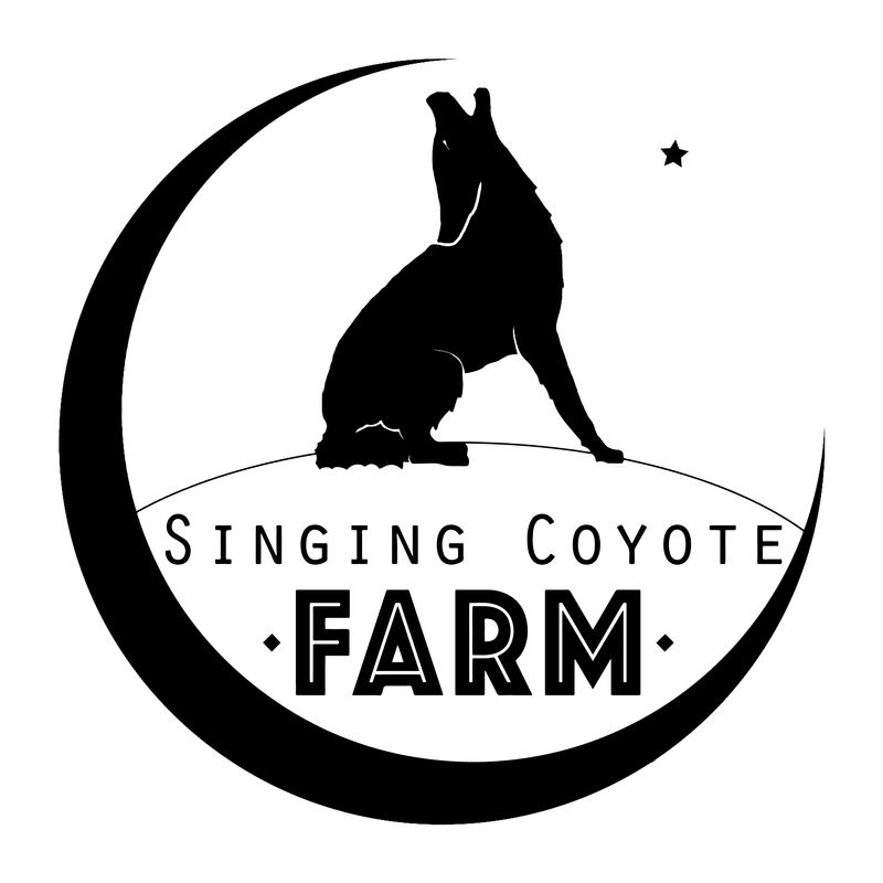 This was a really fun logo to create, as every aspect of it has a special meaning to my dad and I. My dad and I have always seen the new moon and star as "our thing." One night when I was in jr. high, we drove out and had burgers at Ratibor. On the way home, we saw the moon and star and it was so pretty we decided to make a wish. Since then, every time one of us sees the new moon and star, we call the each other and tell them to go outside and make a wish. When my dad asked me to make the logo for him, he wanted that to be the main aspect of it. The name, Singing Coyote Farm, came from the many coyotes we always hear "singing" at night at my parent's home. When we first moved out to the country, hearing the coyotes was a new, chilling experience for my family. My dad has always seen the coyote's howl as a magical, spiritual sound, and knew that's what he wanted to name the farm after. We wanted to make the ground the coyote stands on something that can be changed easily or added to. By making it a blank landscape, it will be easy to add features that go with whatever type of brew it will go on. For instance, if he makes a Mexican Lager, we could add a sombrero to the coyote and a cactus to the landscape. If he makes a winter, seasonal brew, we could add a christmas tree. This logo lends itself lots of room for versatility. There are still changes that need to be made (clearly) and colors that need to be added for an actual label design, but so far, my dad is very proud of the initial logo concept and I am happy I can help him brand our family farm.
|
AuthorMy name is Katherine. Archives
October 2015
Categories
All
|

 RSS Feed
