Google's new logo has received quite a bit of criticism. Compare the old vs. new below....
 |  |
Personally, I like the new logo! Google's logo has always been a serif font, so it's refreshing to see something different. Both logos are great (obviously, it's Google) but I love how the logo is playful and inviting. I think it reflects Google's ever-changing brand personality better than the strict, intelligent serif logo.
A lot of the criticism for the new logo has been based on the idea that, "The new logo looks childish and unintelligent." While I agree that the new logo is definitely less academic looking than previous versions, I think it reflects the recent updates and changes Google has made to their overall brand. For example, this logo will make a lot more sense when paired with Google Hangouts. Yes, Google used to be a more "academic" brand, but they have changed a lot since they first started as a search engine.
Check out the video below to see their evolution:
Criticism is bound to come with any change, and I'm sure Google dealt with similar critics with past logo changes. Regardless, it's obvious (to me, at least) that a lot of time and effort went into developing the new logo. In my opinion, it matches Google's brand personality and is a more accurate reflection of what Google is capable of.
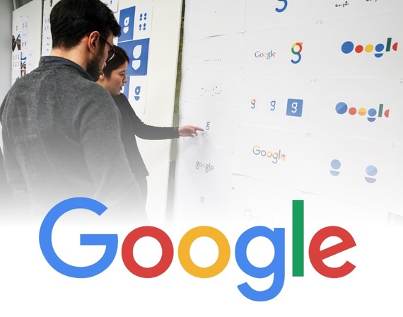
And just saying, I am REALLY glad they didn't go with the logo on the top right of the photo above!
 RSS Feed
