Brought to you by: Lobster Roll Lay's
Here's the packaging... Do any of my fellow typograholics see what I'm talking about?
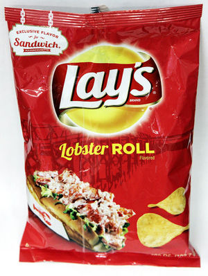
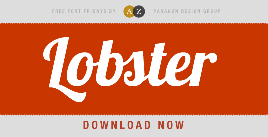
"Lobster" is written in Lobster font! Brilliant.
I don't have cable, so my minor geek-attack happened when I was at home watching TV with my mom. I saw the commercial for Lay's new sandwich flavored chips and I kind of freaked. Of course my mom didn't know what I was talking about so I had to explain.
What I'm wondering is, which designer decided to pull this stunt? Don't get me wrong, I think the font choice looks great, but you KNOW someone in the department debated about this before submitting the design. I wonder if they knew that other typography geeks would notice and then talk about it?
If you like the font and are interested in using it in your designs (for you know, Choose Your Own Live Lobster ads) click the image below to download it for free.
Whether or not this font was chosen for the right reason, I think it was a great opportunity to create an inside joke among designers and a great font choice for the packaging.
Well played, Lay's.
Well played, Lay's.
 RSS Feed
